Jython - Using the Swing GUI library
One of the major features of Jython is its ability to use the Swing GUI library in JDK. The Standard Python distribution (often called as CPython) has the Tkinter GUI library shipped with it. Other GUI libraries like PyQt and WxPython are also available for use with it, but the swing library offers a platform independent GUI toolkit.
Using the swing library in Jython is much easier compared to using it in Java. In Java the anonymous classes have to be used to create event binding. In Jython, we can simply pass a function for the same purpose.
The basic top-level window is created by declaring an object of the JFrame class and set its visible property to true. For that, the Jframe class needs to be imported from the swing package.
from javax.swing import JFrame
The JFrame class has multiple constructors with varying number of arguments. We shall use the one, which takes a string as argument and sets it as the title.
frame = JFrame(“Hello”)
Set the frame’s size and location properties before setting its visible property to true. Store the following code as frame.py.
from javax.swing import JFrame

frame = JFrame("Hello")
frame.setDefaultCloseOperation(JFrame.EXIT_ON_CLOSE)
frame.setLocation(100,100)
frame.setSize(300,200)
frame.setVisible(True)
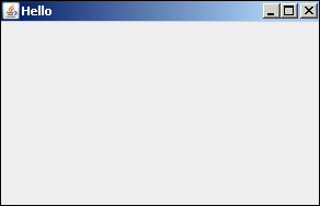
Run the above script from the command prompt. It will display the following output showing a window.

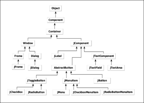
The swing GUI library is provided in the form of javax.swing package in Java. Its main container classes, JFrame and JDialog are respectively derived from Frame and Dialog classes, which are in the AWT library. Other GUI controls like JLabel, JButton, JTextField, etc., are derived from the JComponent class.
The following illustration shows the Swing Package Class hierarchy.

The following table summarizes different GUI control classes in a swing library −
| Sr.No. | Class & Description |
|---|---|
| 1 |
JLabel
A JLabel object is a component for placing text in a container.
|
| 2 |
JButton
This class creates a labeled button.
|
| 3 |
JColorChooser
A JColorChooser provides a pane of controls designed to allow a user to manipulate and select a color.
|
| 4 |
JCheckBox
A JCheckBox is a graphical component that can be in either an on(true) or off (false) state.
|
| 5 |
JRadioButton
The JRadioButton class is a graphical component that can be either in an on (true) or off (false) state. in a group.
|
| 6 |
JList
A JList component presents the user with a scrolling list of text items.
|
| 7 |
JComboBox
A JComboBox component presents the user with drop down list of items
|
| 8 |
JTextField
A JTextField object is a text component that allows for the editing of a single line of text.
|
| 9 |
JPasswordField
A JPasswordField object is a text component specialized for password entry.
|
| 10 |
JTextArea
A JTextArea object is a text component that allows editing of a multiple lines of text.
|
| 11 |
ImageIcon
A ImageIcon control is an implementation of the Icon interface that paints Icons from Images
|
| 12 |
JScrollbar
A Scrollbar control represents a scroll bar component in order to enable the user to select from range of values.
|
| 13 |
JOptionPane
JOptionPane provides set of standard dialog boxes that prompt users for a value or informs them of something.
|
| 14 |
JFileChooser
A JFileChooser control represents a dialog window from which the user can select a file.
|
| 15 |
JProgressBar
As the task progresses towards completion, the progress bar displays the task's percentage of completion.
|
| 16 |
JSlider
A JSlider lets the user graphically select a value by sliding a knob within a bounded interval.
|
| 17 |
JSpinner
A JSpinner is a single line input field that lets the user select a number or an object value from an ordered sequence.
|
We would be using some of these controls in subsequent examples.
No comments:
Post a Comment